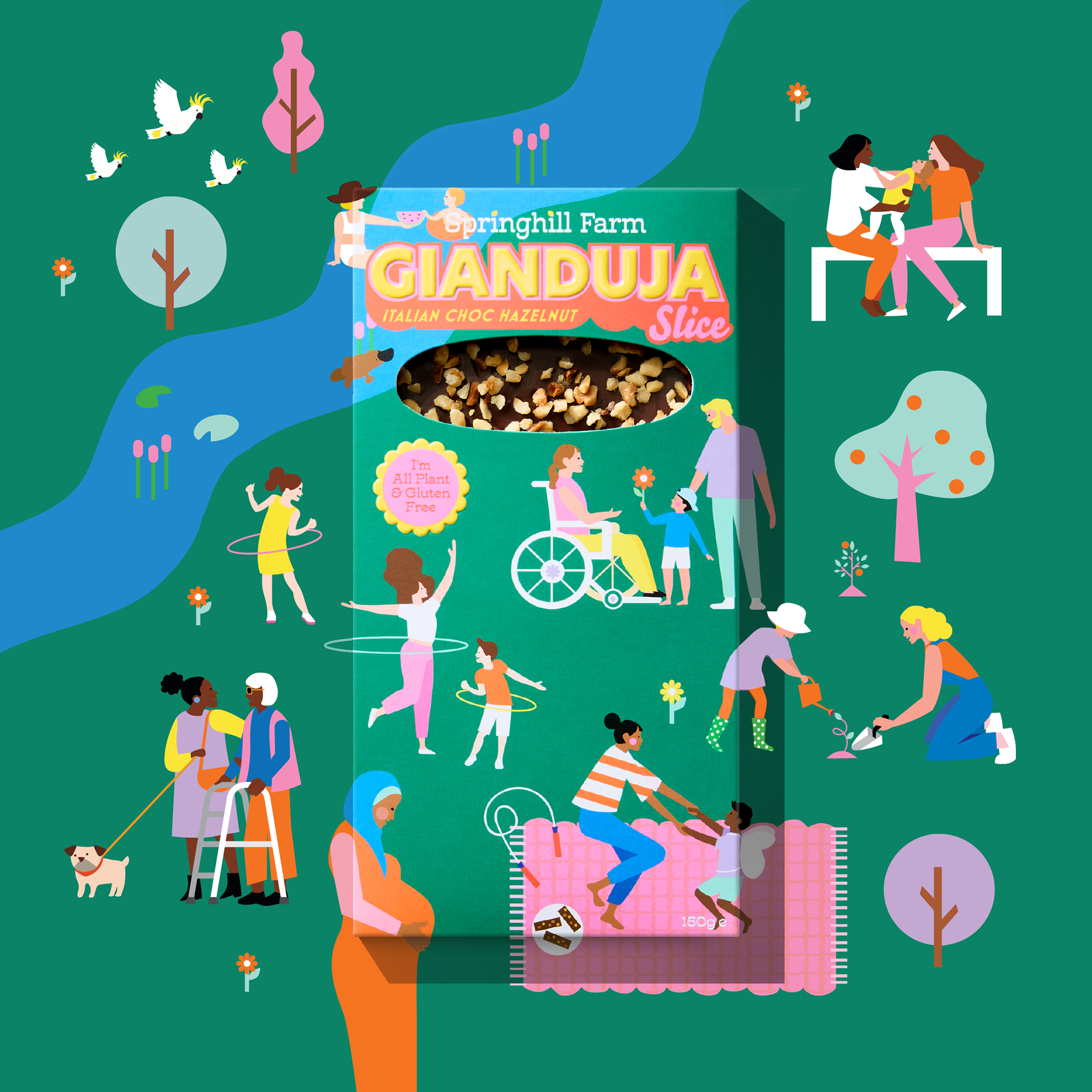
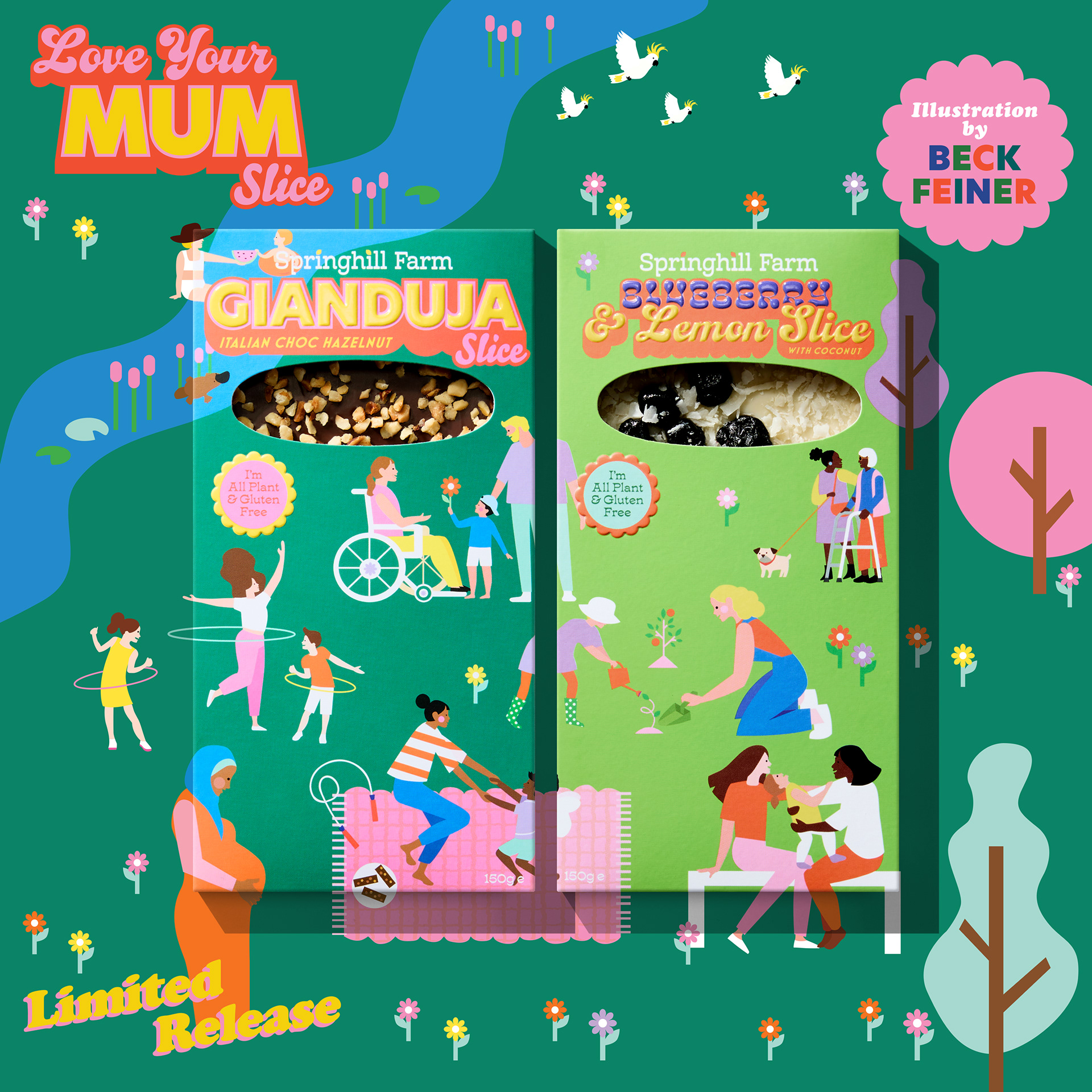
I led the illustration and packaging design for Springhill Farm chocolate bars from concept to shelf—developing the creative idea, illustrating the artwork, and translating it into a cohesive packaging system that brought the brand’s story to life across the full product rollout.
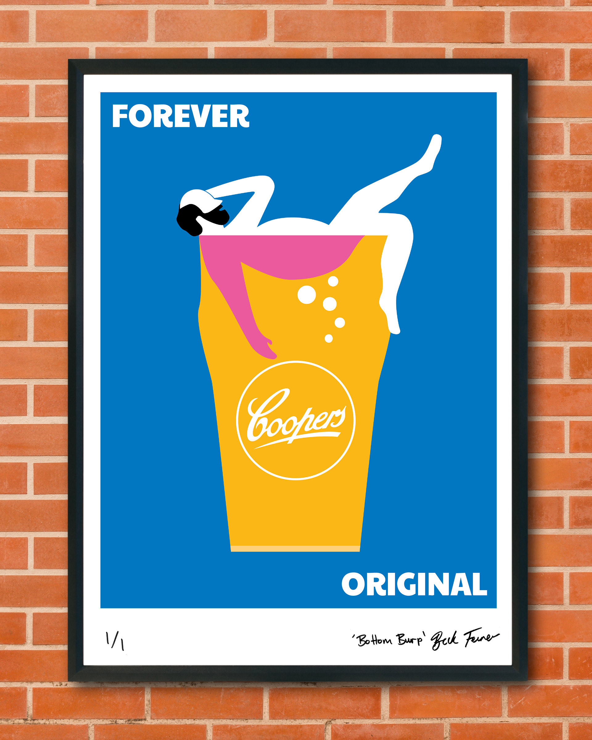
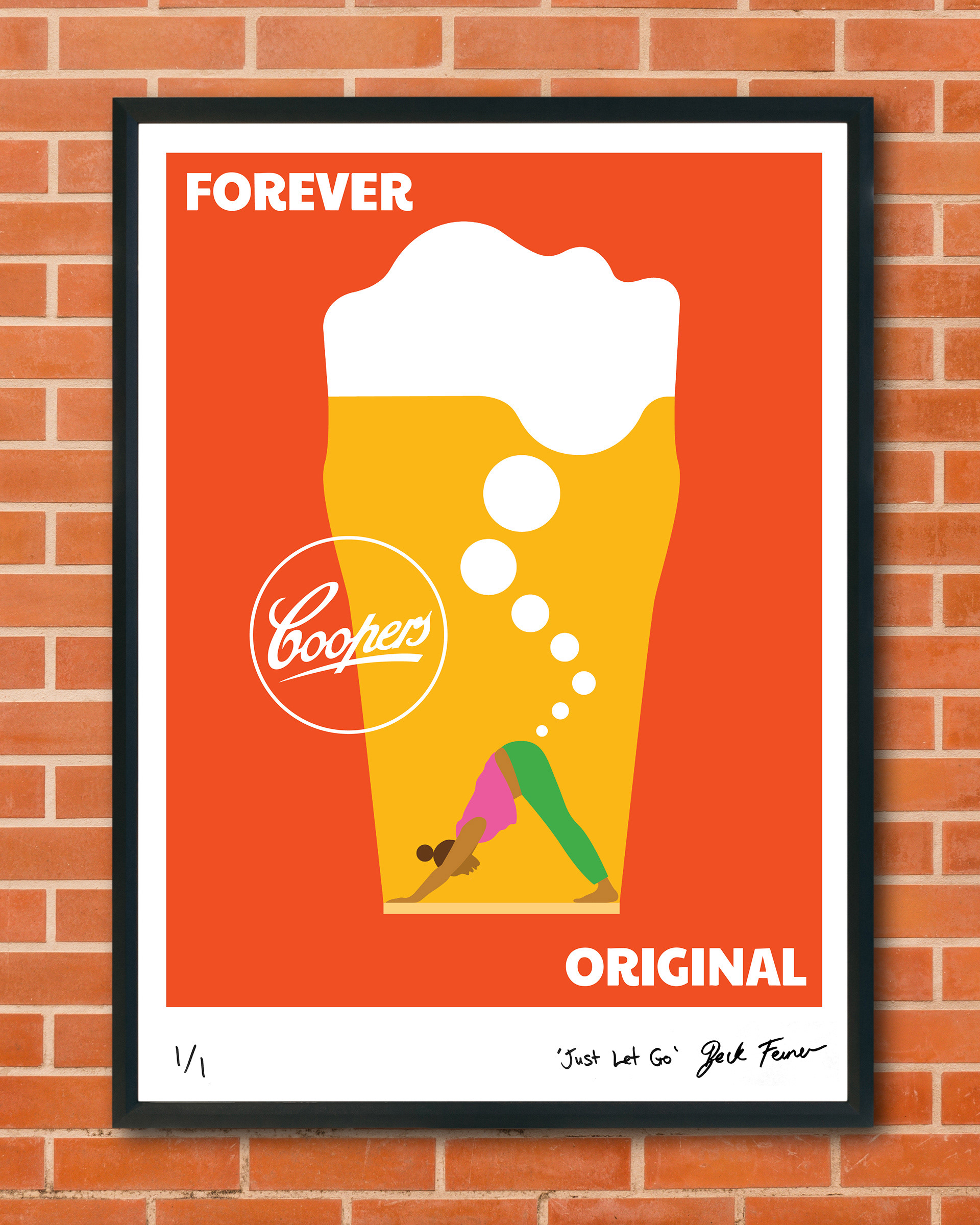
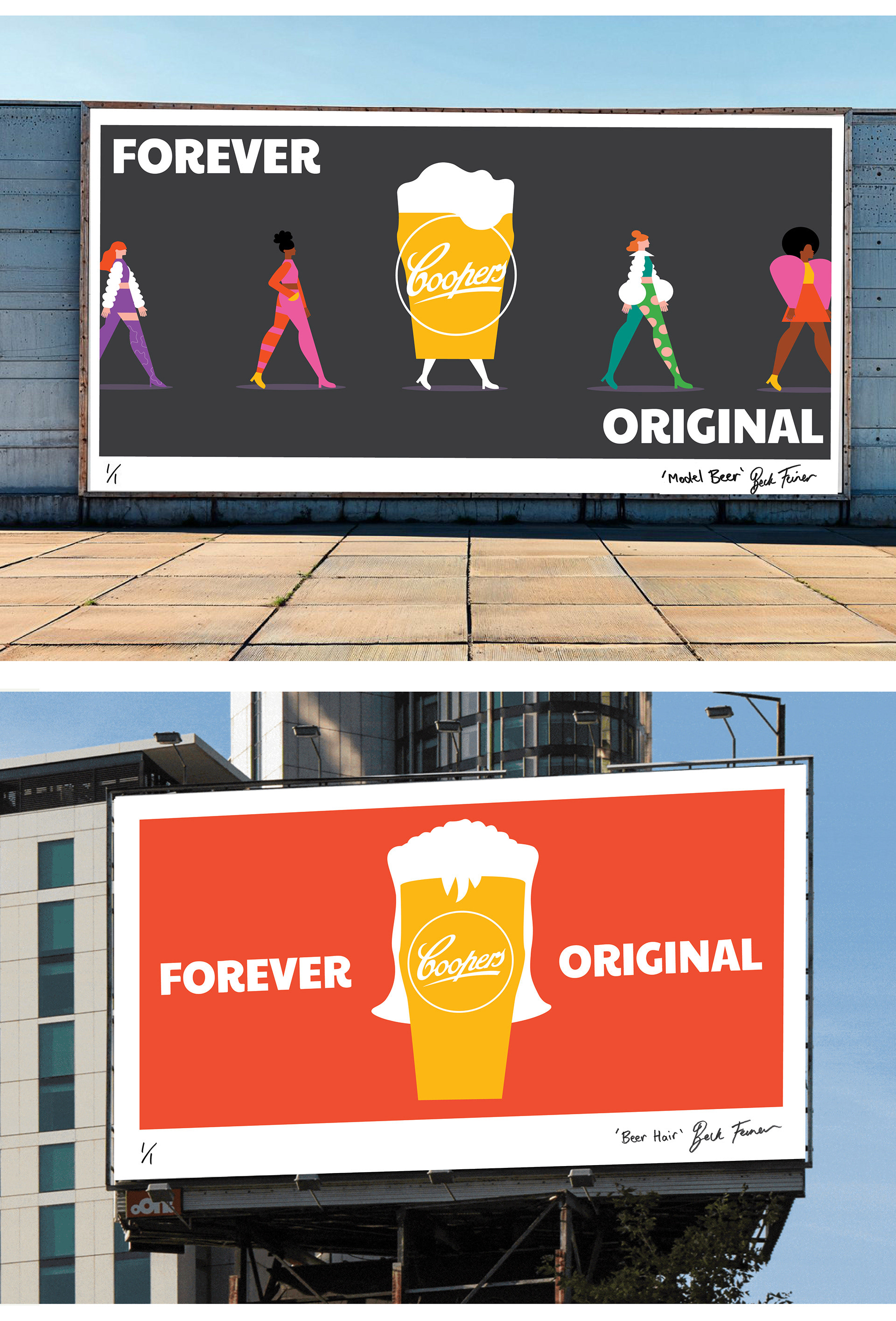
Coopers Brewery has launched a new brand campaign, which emphasises the independent family-owned brewery’s ‘Forever Original’ attitude. The campaign features one-of-a-kind artworks created by artists/designers, including me.
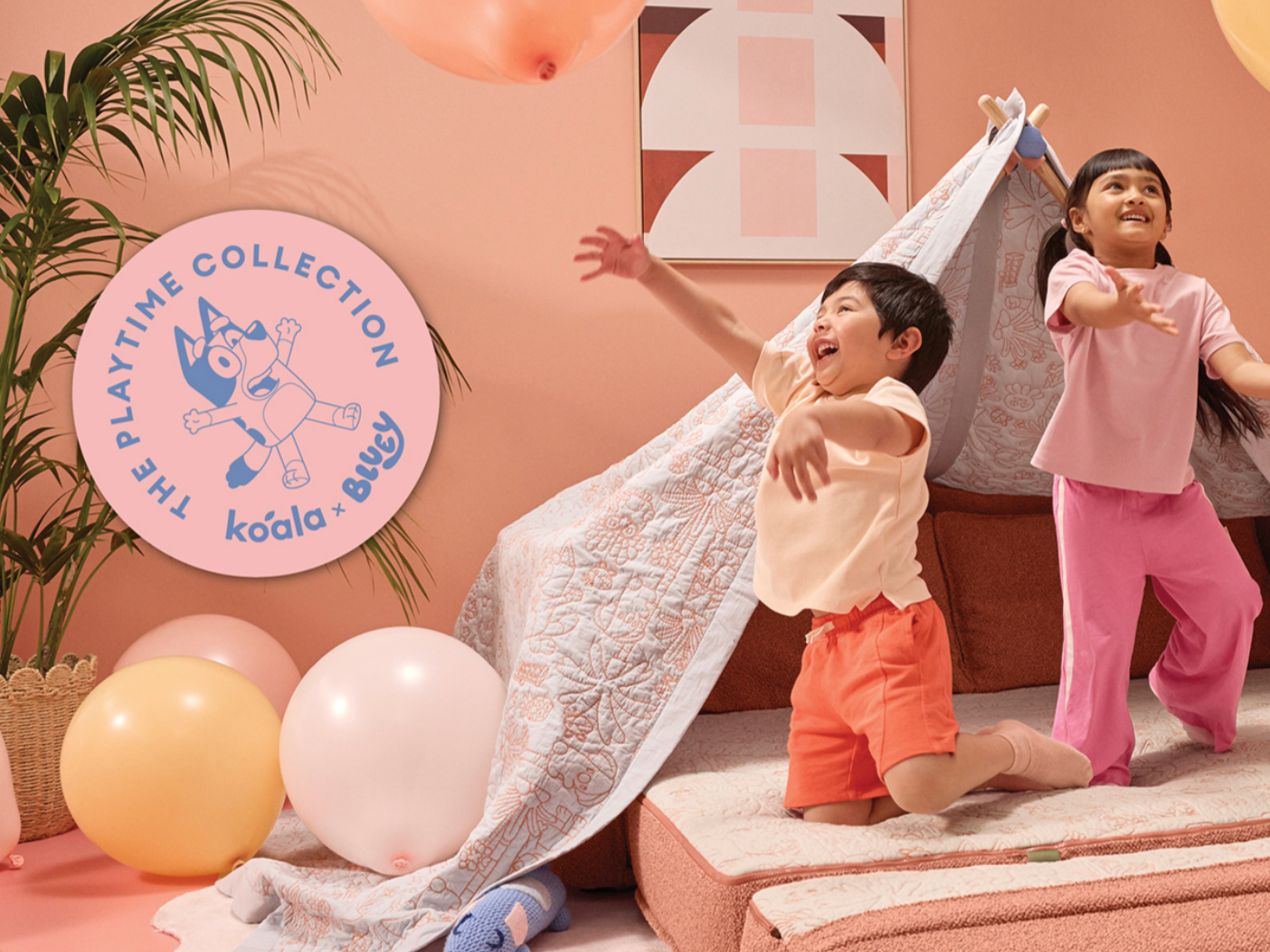
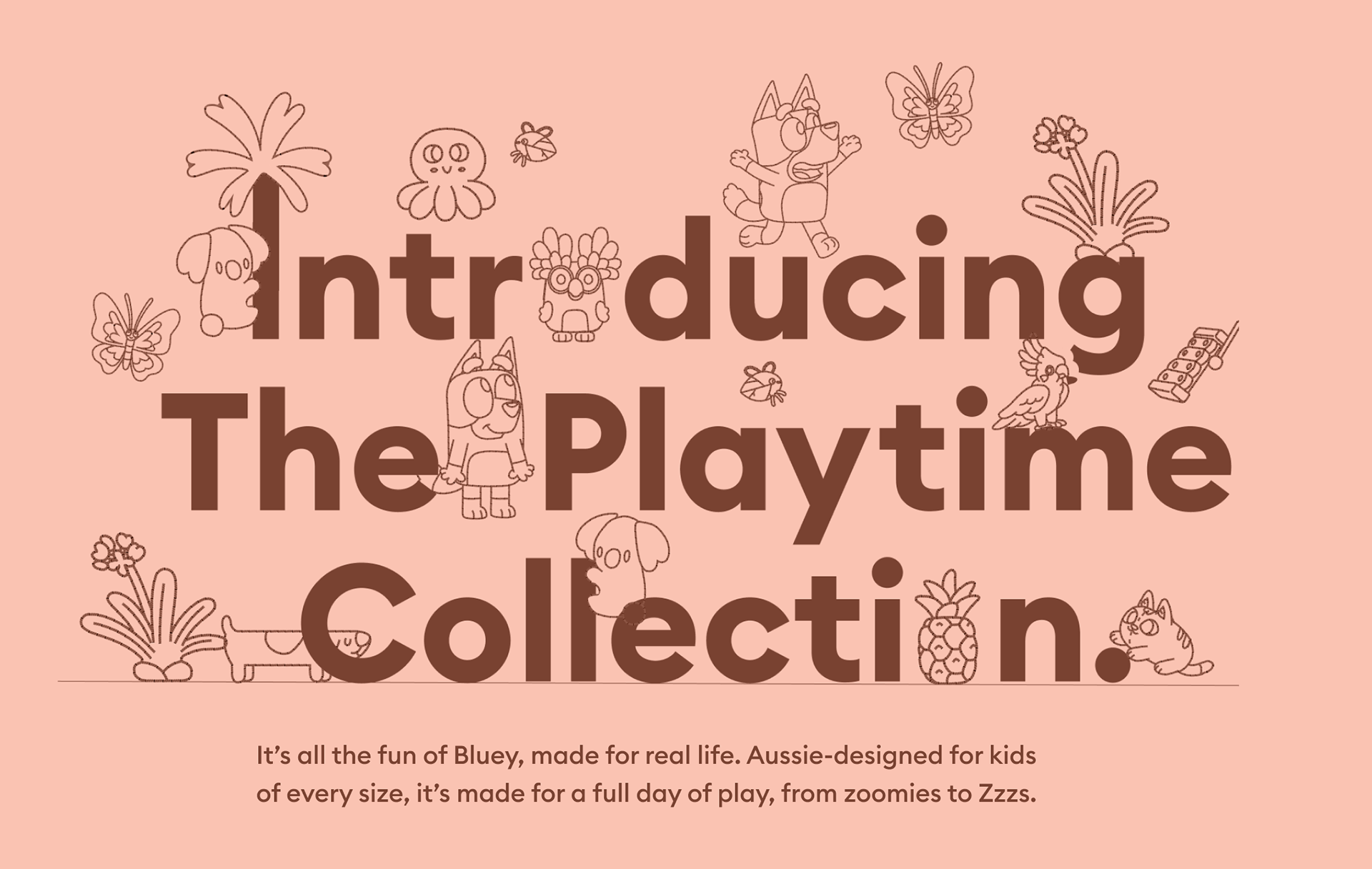
An absolute dream project — I was the Senior Art Director and Graphic Designer on the Koala × Bluey collaboration, bringing beloved episodes like Keepy Uppy and Sleepytime to life through the launch of a sofa, bed, and homewares collection.
I led the project from concept through to art direction, design, and production, creating campaign visuals, graphic assets, and layouts that unified the product story across digital, print, and social channels.
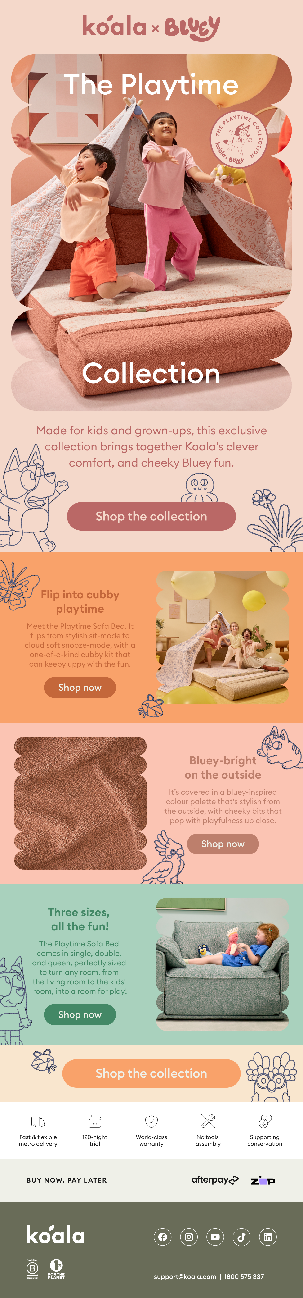
A typographic illustration created for the Bluey × Koala Furniture collaboration, developed as part of a larger integrated campaign. The piece was designed to capture the playful spirit of the series while supporting the visual language of the launch across digital, print, and social touchpoints.
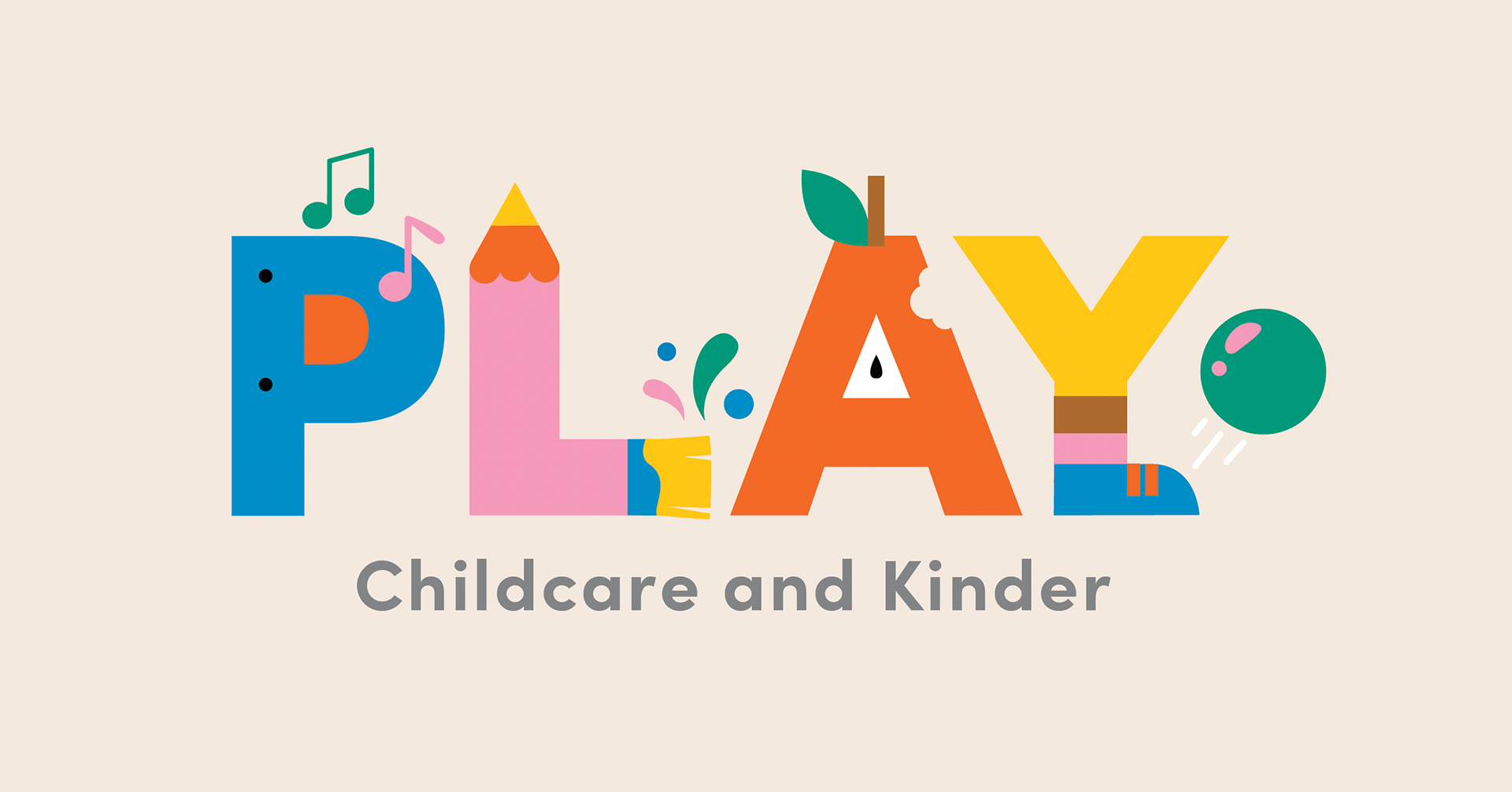
A logo created for a Melbourne-based childcare centre group, balancing playfulness with a fresh, modern aesthetic. The mark was designed to feel current and confident, while remaining flexible and scalable across signage, digital platforms, and printed materials.

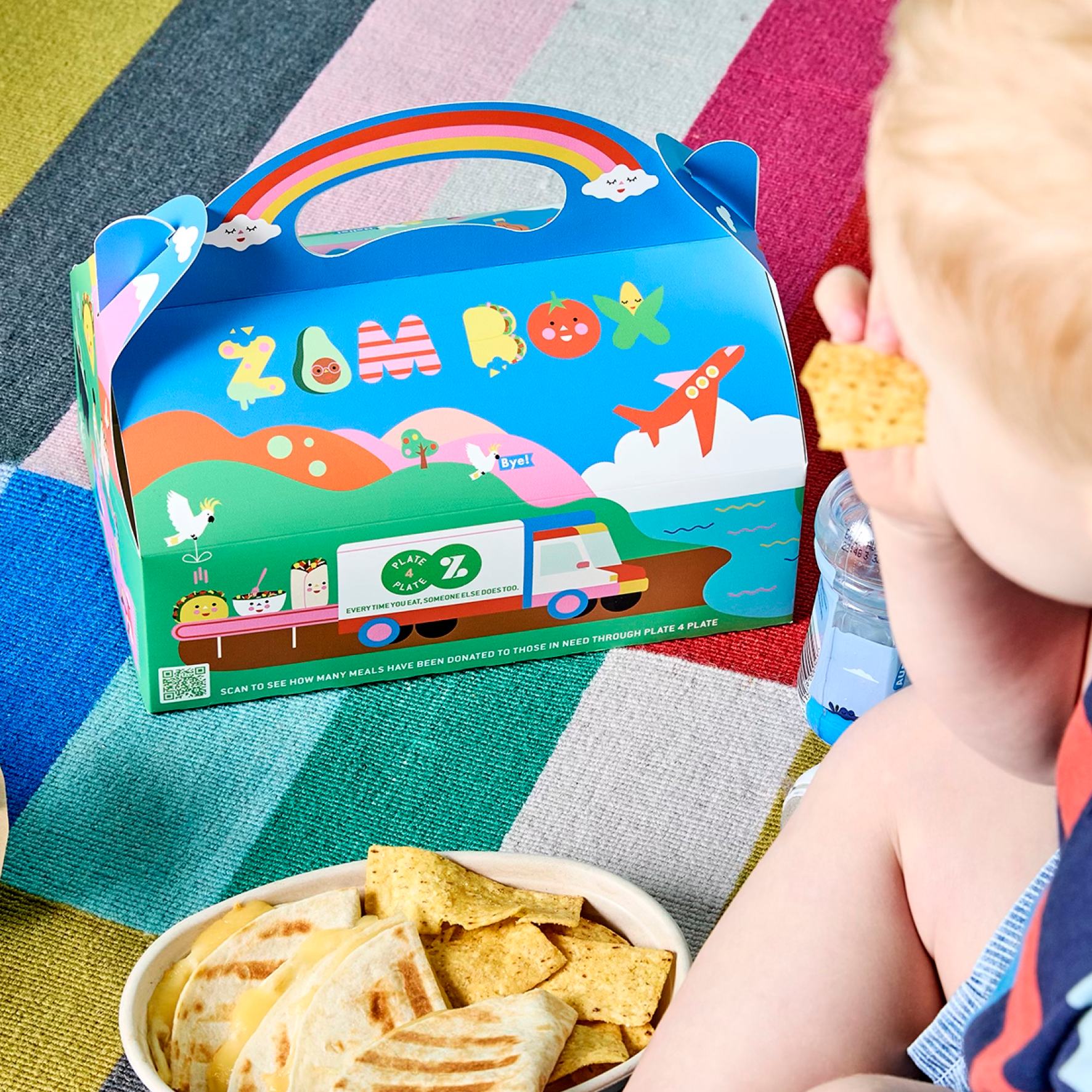
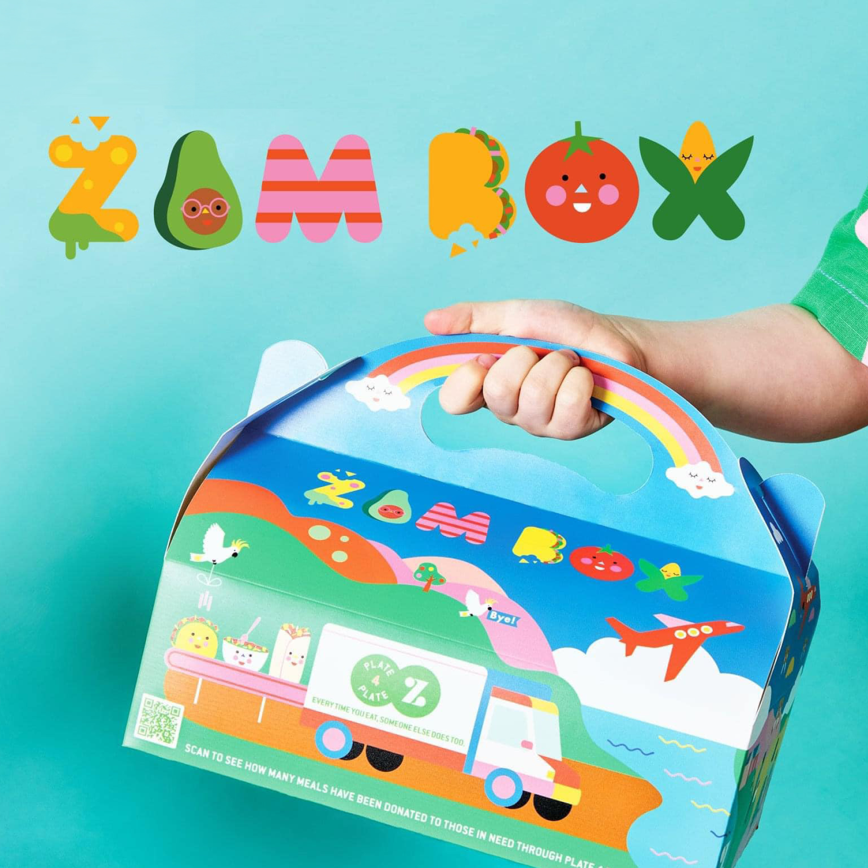
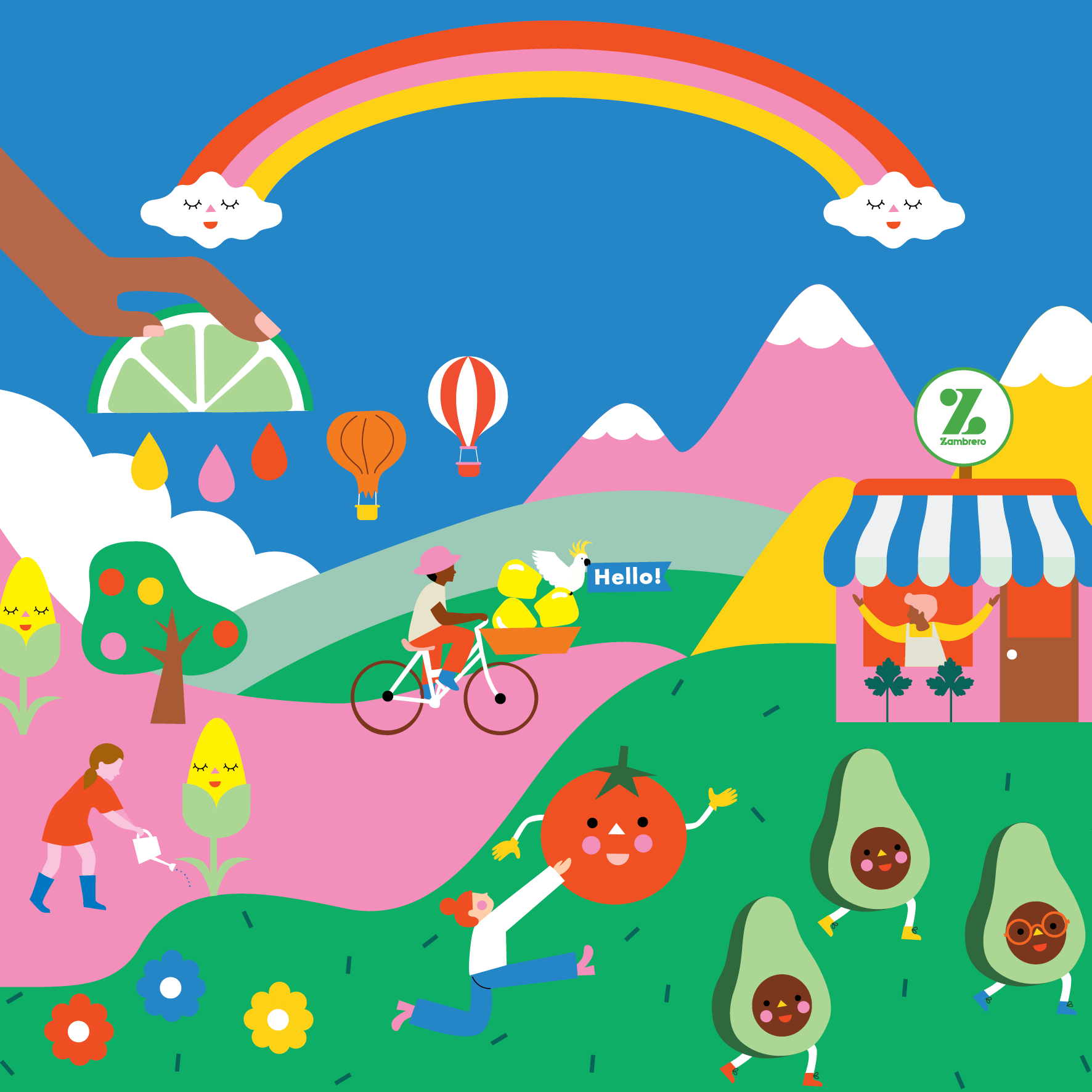
For Zambrero’s new kids’ meals, I wanted the packaging to communicate the brand’s humanitarian values in a way that was engaging and fun for kids. The challenge was translating a socially conscious message—one that resonates with adults—into a playful, interactive experience that children could enjoy and understand.
I approached this by designing a box full of vibrant illustrations, stickers, and interactive elements that tell the story of Zambrero’s Plate 4 Plate program. Every detail was crafted to make kids feel involved in the act of giving, while keeping the experience entertaining and age-appropriate. The result was packaging that celebrates the brand’s generosity and impact, without feeling heavy-handed, turning a humanitarian message into something playful, tangible, and memorable.
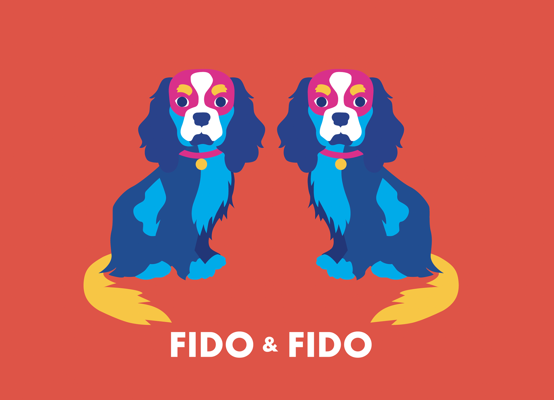
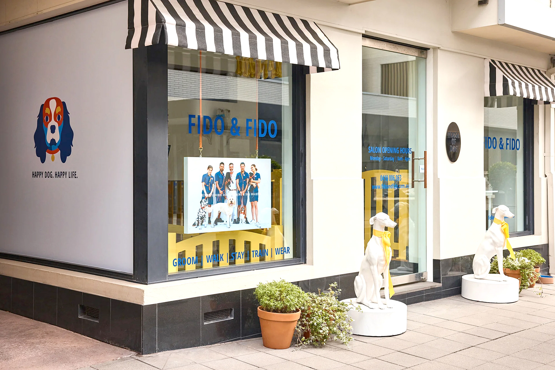
Fido & Fido is a premium, Sydney-based pet care company offering dog walking, grooming, training, and luxury boarding services. I developed the brand’s logo and bespoke dog illustration for their launch, creating a distinctive visual identity that reflects the company’s high-end yet friendly approach. The branding has been rolled out across multiple touchpoints, including service vans, in-store environments, and digital platforms, ensuring a cohesive and recognisable presence both on the street and online.
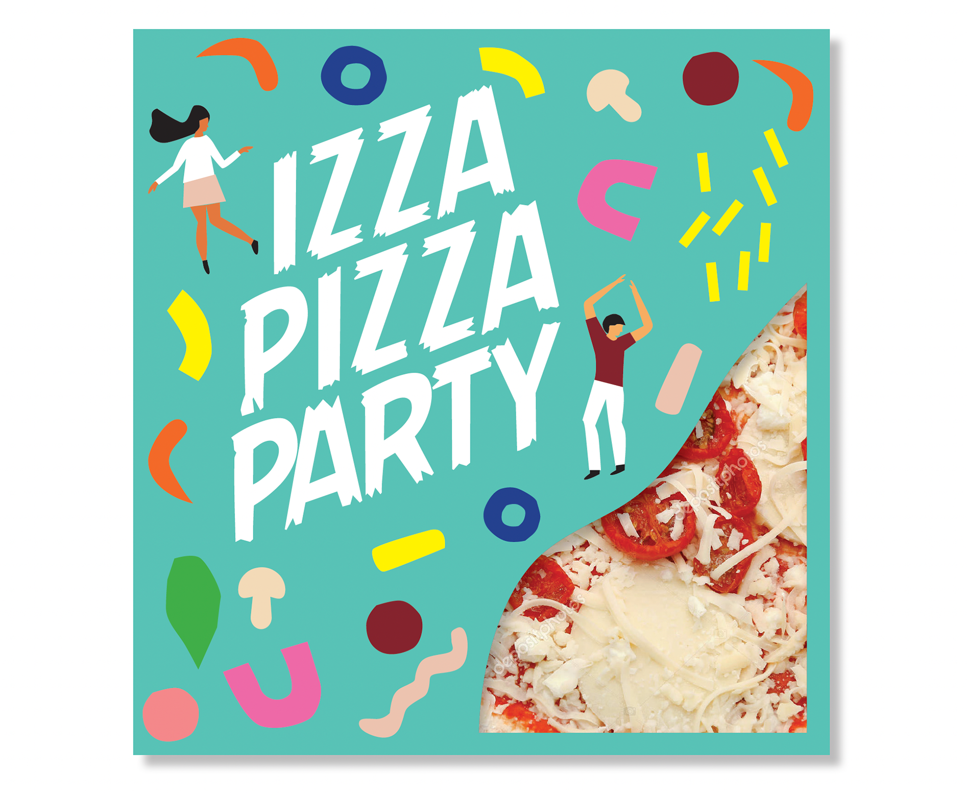
I designed the logo and pizza packaging for a new food company, creating a bold and memorable visual identity that stands out both on-shelf and at the table. The design balances appetite appeal with strong branding to ensure instant recognition.
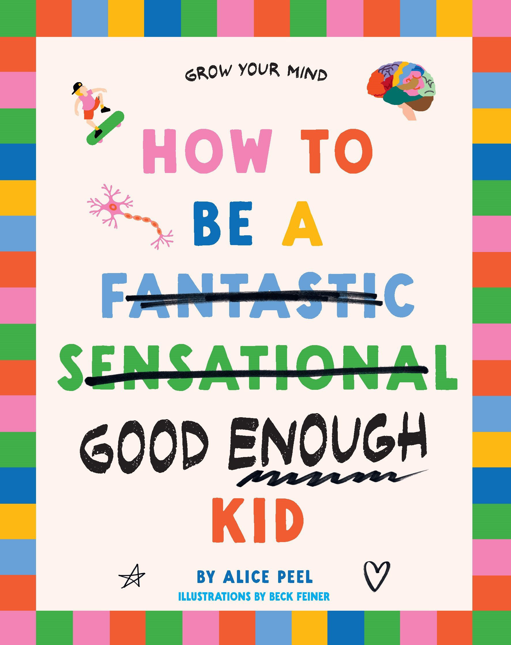
I designed the cover for a children’s book focused on mental health, creating an inviting and approachable visual that resonates with young readers while supporting the book’s important message. The design balances warmth, playfulness, and clarity to engage children and parents alike, while reflecting the book’s themes of emotional wellbeing and self-awareness.
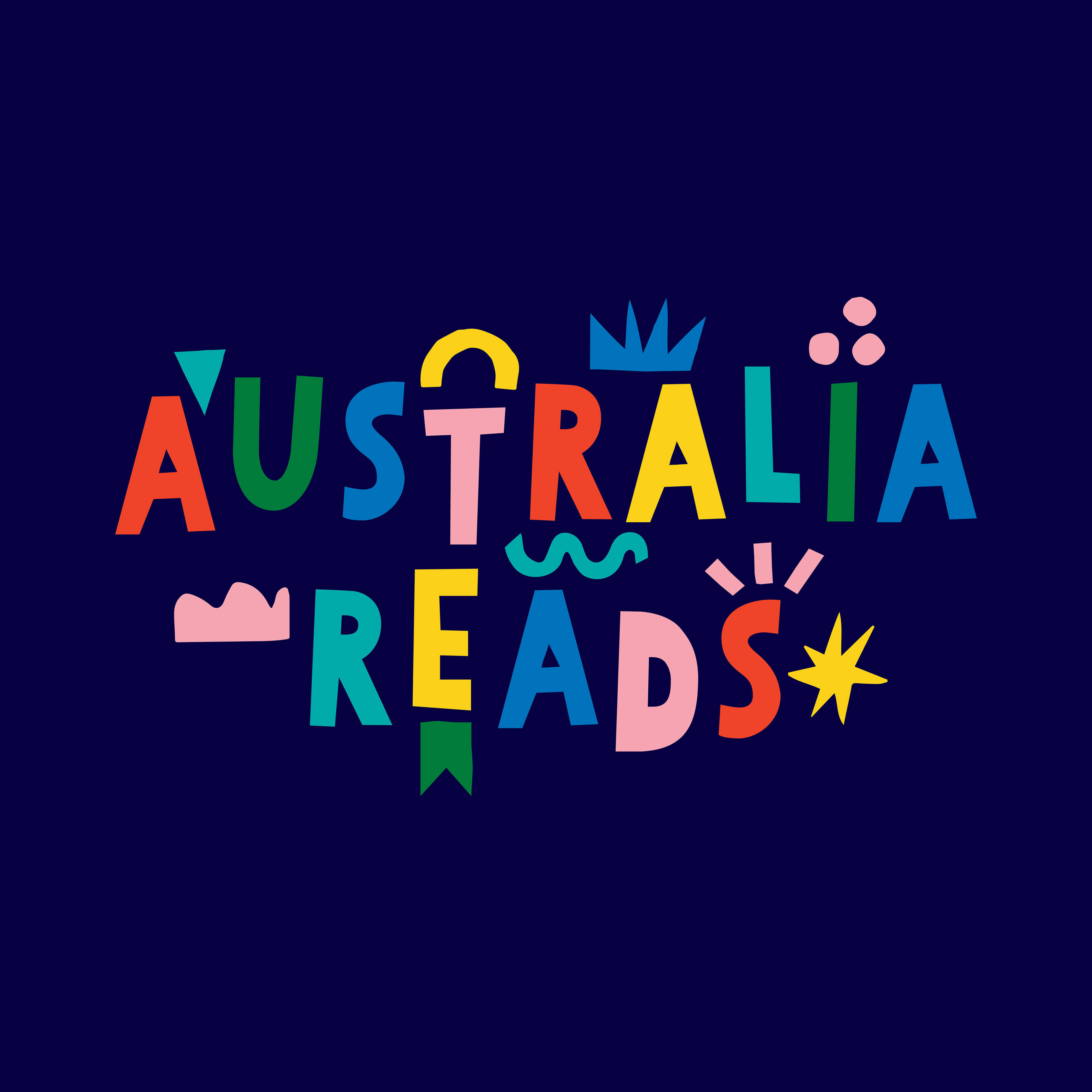
Australia Reads is a collaborative, not-for-profit initiative and national campaign dedicated to increasing reading rates and promoting the joy of reading for pleasure across Australia. When they sought a brand refresh, I was invited to design a new logo that reflects the campaign’s forward-thinking and innovative spirit, while capturing the joy and accessibility of reading. The result is a versatile, contemporary identity that communicates both energy and approachability for the brand.
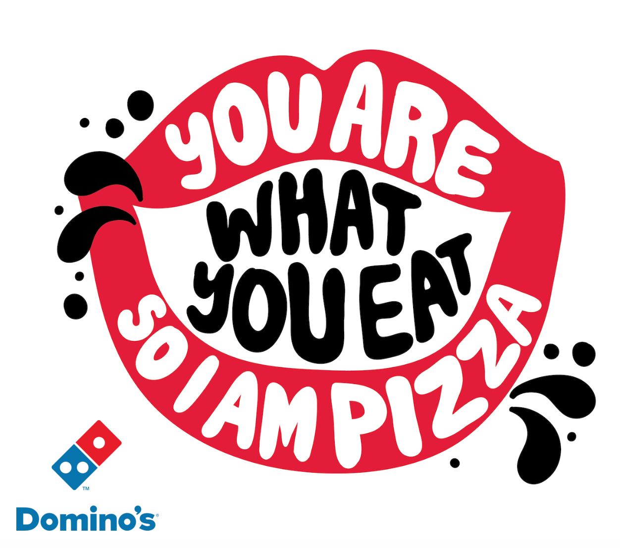
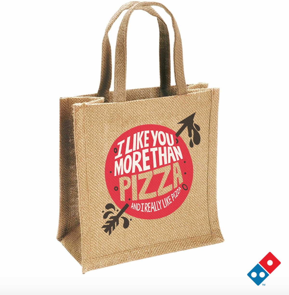
Domino’s needed fun, playful typography for their merch, and I was the perfect person for the job—type is both my superpower and my true love.
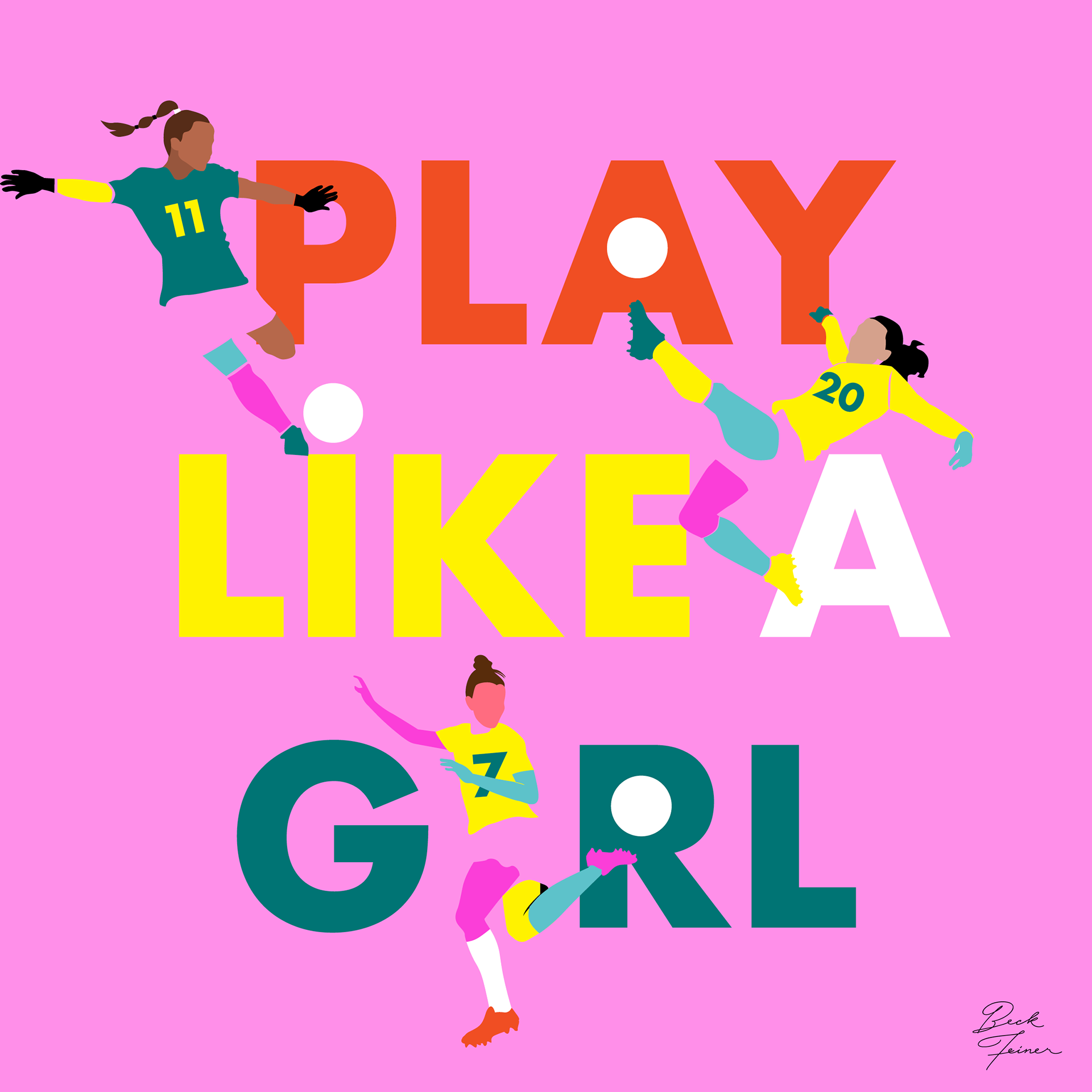
During the Women’s Soccer World Cup, I was invited to develop a series of playful, typographic pieces celebrating the achievements and brilliance of women in sports. I crafted designs that combined energy, personality, and bold messaging to highlight these athletes’ strength and inspire fans. The project allowed me to merge my love for type with a meaningful message, creating work that was both visually engaging and empowering.
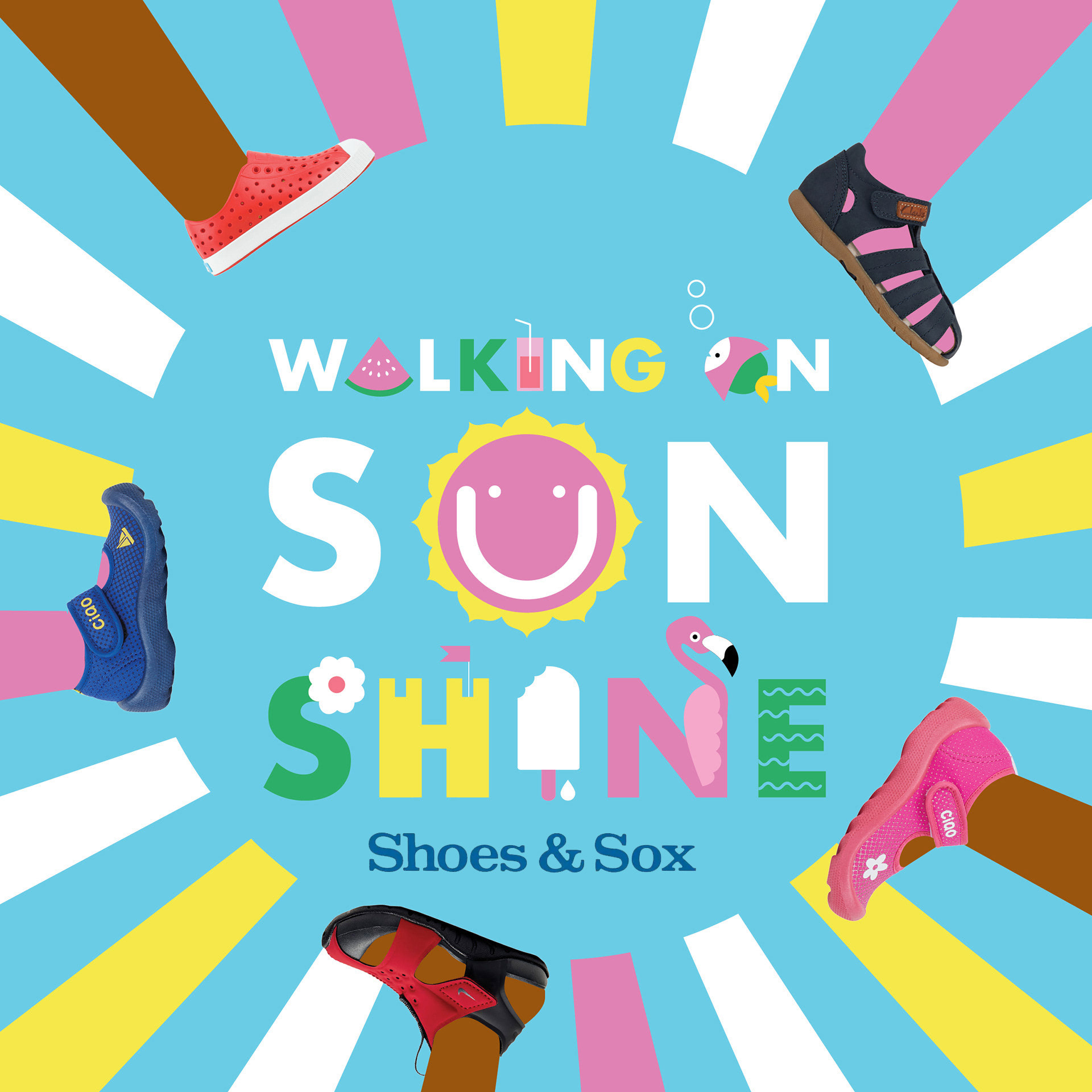
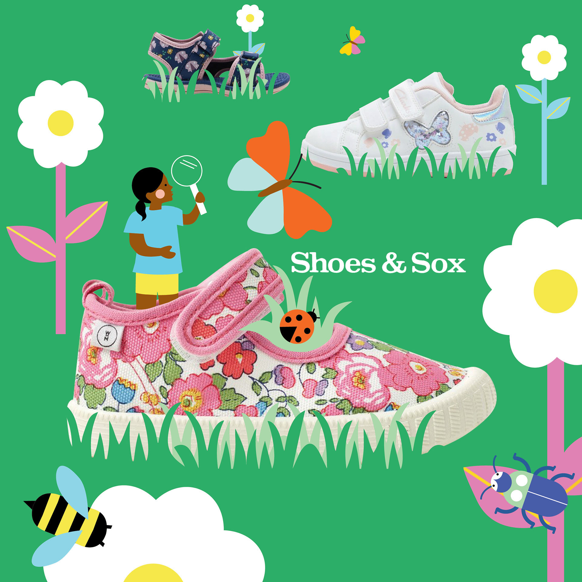
I conceptualized and executed a comprehensive summer campaign for Shoes and Sox, taking it from the initial idea stage all the way through to full brand rollout. This included developing the creative concept, designing marketing assets, coordinating cross-channel promotions, and ensuring cohesive messaging across all touchpoints. The campaign successfully captured the seasonal spirit, strengthened brand identity, and drove engagement with our target audience.
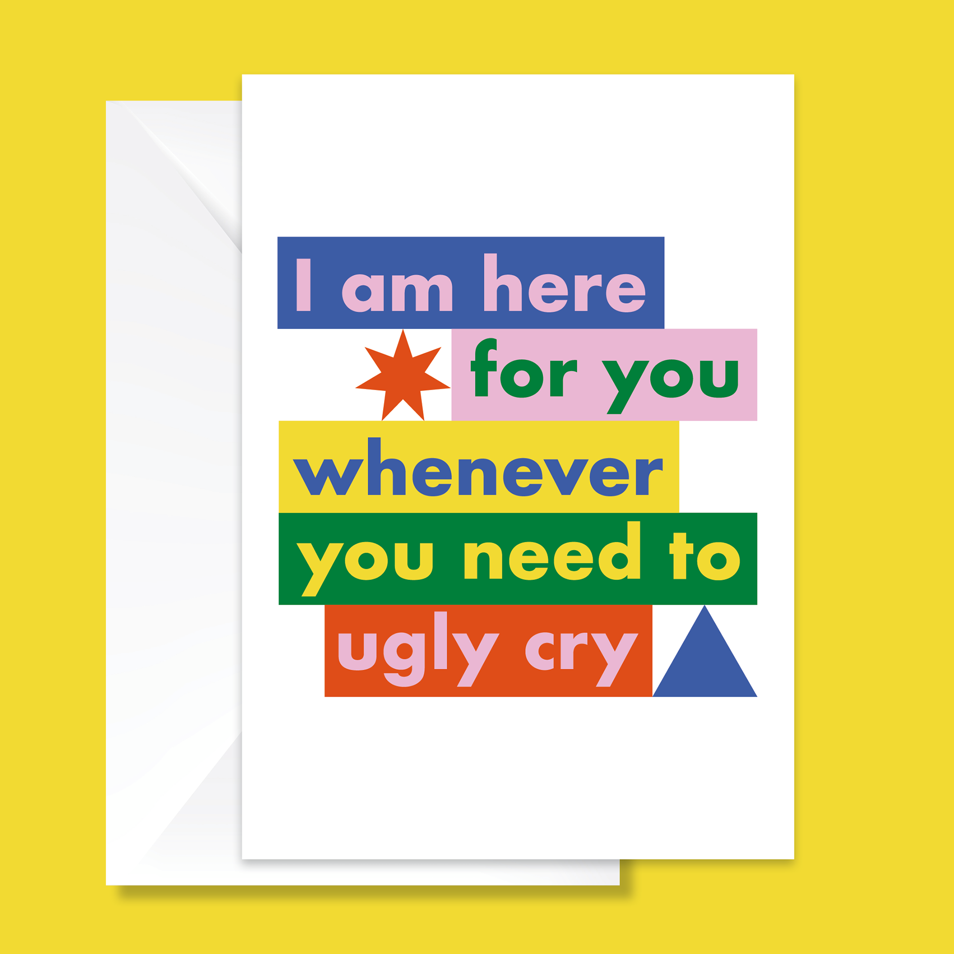
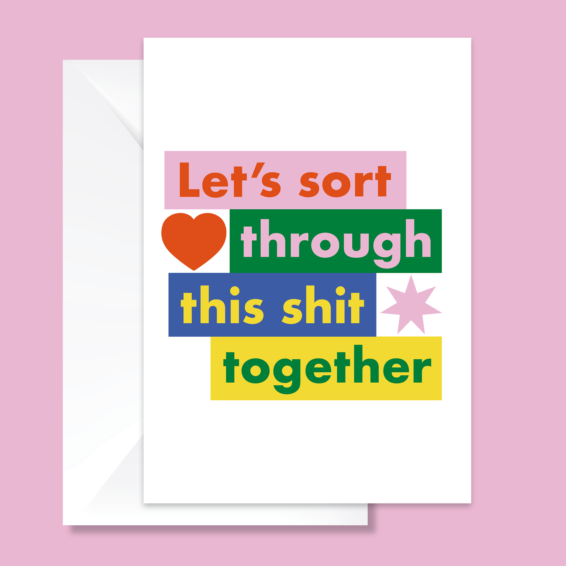
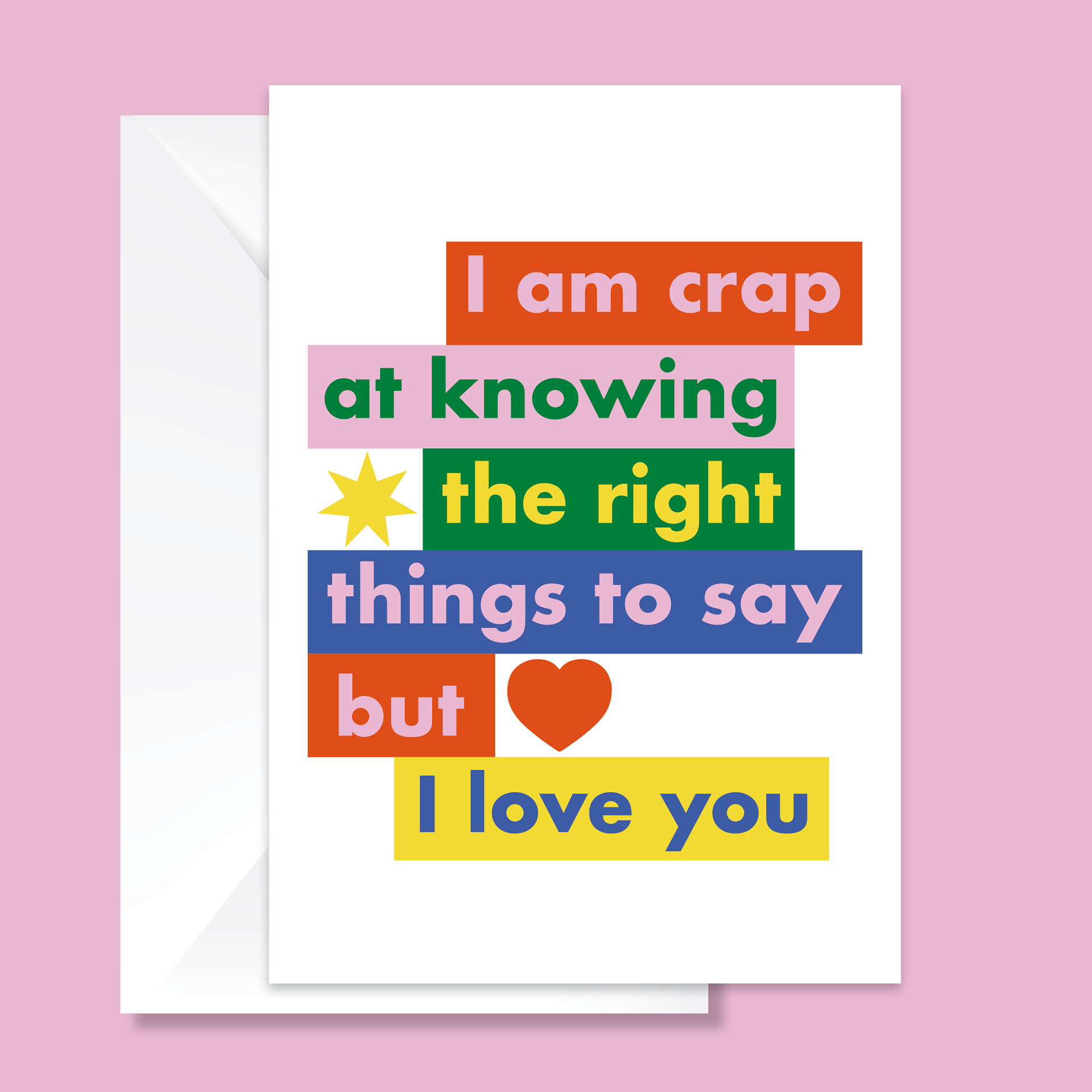
I was commissioned to develop a series of greeting cards focused on mental health and supporting people in need. I wrote the copy and designed the artwork, crafting messages that were truthful and meaningful while also incorporating moments of humor to bring light during someone’s darkest times. The project allowed me to balance sensitivity with levity, creating work that resonated emotionally and offered comfort in an authentic, human way.
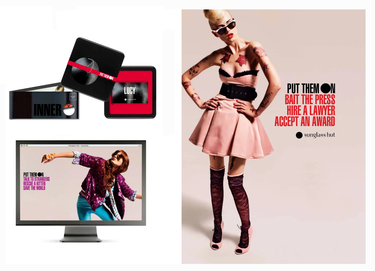
I was the Art Director and Graphic Designer for Sunglass Hut for several years, creating memorable fashion shoots that extended across digital platforms, packaging and in-store visual merchandising. I focused on producing bold, cohesive campaigns that elevated the brand, resonated with customers, and stayed ahead of evolving fashion trends.
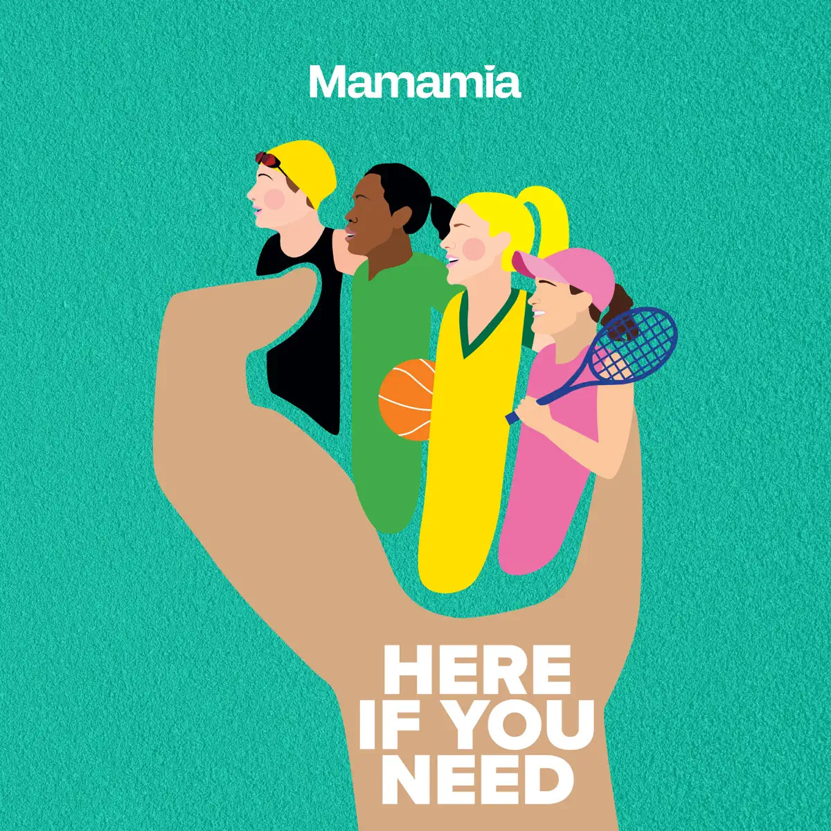
Mamamia asked me to create the design for their latest podcast, which highlights women in sport. I developed visuals that were bold, engaging, and reflective of the podcast’s empowering message, helping to amplify the stories of female athletes and celebrate their achievements.